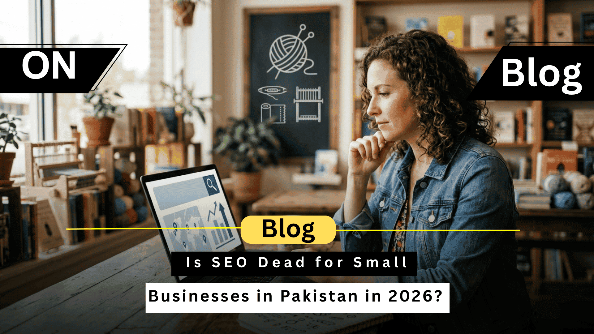
Is SEO Dead for Small Businesses in Pakistan in 2026?
No, SEO is not dead for small businesses in Pakistan in 2026. Search engine optimization remains the most cost-effective channel for sustainable organic traffic, lead generation, and brand visibility. People question SEO’s viability because AI tools like ChatGPT and Gemini, Google algorithm updates, and zero-click searches have changed how people find information. These shifts transformed SEO strategy, not its effectiveness. What changed is the execution methodology. Keyword stuffing died. Intent-driven content, technical authority, local SEO optimization, and E-E-A-T signals now determine rankings and conversions for Pakistani SMEs. Why Do People Think SEO Is Dead in 2026? Perception of SEO death stems from AI tools providing instant answers, algorithm updates penalizing low-quality content, zero-click searches keeping users on Google, and paid advertising dominance in competitive markets. Generative AI search through ChatGPT, Gemini, and Perplexity creates alternative discovery channels. Users ask questions conversationally instead of typing keywords into search boxes. Google algorithm updates like Helpful Content and Core Updates aggressively demote thin content, AI-generated spam, and manipulative tactics. Sites relying on old SEO techniques lost 40-90% of organic traffic overnight. Zero-click searches display answers directly in AI overviews, featured snippets, and knowledge panels. Users get information without clicking through to websites, reducing traffic even for top-ranked pages.Paid ads dominate commercial keywords in Pakistan. Google Ads and Facebook advertising deliver immediate visibility while SEO requires months of effort before showing results. What Has Actually Changed in SEO for Pakistani Businesses? SEO evolved from keyword density manipulation to intent-driven content optimization. Search engines now understand context, user goals, and content quality through semantic analysis. Search intent optimization means creating content that matches why people search. Informational queries need educational guides. Commercial queries need comparison frameworks. Transactional queries need clear service pages. Local SEO importance exploded for Pakistani service businesses. Google Business Profile optimization, local citations, and geographic targeting drive customers searching for nearby solutions. E-E-A-T signals (Experience, Expertise, Authoritativeness, Trustworthiness) determine content credibility. Google prioritizes demonstrable expertise over generic information aggregation. Technical authority through Core Web Vitals, mobile-first indexing, schema markup, and crawlability became ranking foundations. Sites with technical issues can’t compete regardless of content quality. Does SEO Still Work for Small Businesses in Pakistan? Yes, SEO delivers measurable ROI for Pakistani SMEs when executed strategically. Local search behavior, cost advantages over paid advertising, and compounding long-term returns make SEO essential. Pakistani consumers heavily use Google for local business discovery. Searches like ‘digital marketing agency Lahore’ or ‘web developer Karachi’ generate high-intent leads actively seeking services. Cost comparison reveals SEO’s efficiency. Google Ads in Pakistan cost PKR 50-200 per click for commercial keywords. SEO requires upfront investment but generates free organic traffic indefinitely. Long-term ROI compounds as rankings improve. Month 1 generates minimal traffic. Month 6 shows steady growth. Year 2 delivers consistent leads without ongoing ad spend. Wondering if SEO works for your industry? See how we help Pakistani businesses rank and convert. What Type of SEO Works in Pakistan in 2026? Effective SEO in Pakistan combines local optimization, content authority, technical foundations, and conversion focus. Generic tactics fail. Targeted strategies win. Local SEO for Service Businesses Google Business Profile optimization with accurate NAP (Name, Address, Phone), service descriptions, customer reviews, and local photos dominates map pack rankings. Local citations in Pakistani directories, location-specific landing pages, and geographic keywords target customers within service areas. ‘SEO services Islamabad’ converts better than generic ‘SEO services.’ Content Authority for Niche Brands Helpful content that solves real problems builds topical authority. In-depth guides addressing specific Pakistani business challenges outperform thin keyword-optimized pages. Structured content with clear headings, scannable formatting, and direct answers optimizes for featured snippets and AI overviews extraction. Technical SEO Foundations Core Web Vitals optimization ensures fast loading speeds, visual stability, and smooth interactions. Pakistani mobile users on slower connections demand performance. Mobile-first indexing, clean site architecture, schema markup for rich snippets, and proper crawlability enable Google to understand and rank content effectively. Conversion-Focused SEO Rankings without conversions waste resources. Conversion-focused SEO targets commercial keywords, optimizes landing pages, implements clear calls-to-action, and tracks lead quality. Customer acquisition cost tracking connects SEO investment to actual revenue. Measure not just rankings but leads generated, deals closed, and ROI delivered. Why Do Small Businesses Fail at SEO in Pakistan? SEO failures stem from hiring cheap providers using spam tactics, building low-quality backlinks, implementing no strategic planning, and skipping technical audits. Cheap SEO providers in Pakistan promise page one rankings for PKR 10,000 monthly. They deliver spam backlinks, keyword-stuffed content, and black-hat tactics that trigger penalties. Spam backlinks from link farms, expired domains, and irrelevant directories harm more than help. Google’s algorithm identifies manipulation and demotes sites using these tactics. No strategic approach means random blog posts without audience research, technical issues blocking crawlers, and content that doesn’t match search intent. Technical audits identify crawlability problems, mobile usability issues, page speed bottlenecks, and indexing errors. Skipping audits leaves fundamental problems unfixed. Tired of SEO providers who promise the world but deliver nothing? Get an honest technical SEO audit revealing exactly what’s holding your rankings back. SEO vs Paid Ads in Pakistan: Which Is Better in 2026? SEO and paid advertising serve different purposes. Paid ads deliver immediate traffic but require continuous spending. SEO builds sustainable organic visibility with compounding returns. Cost comparison over 12 months: Google Ads spending PKR 100,000 monthly generates traffic only while active. SEO investment of PKR 150,000 total builds assets generating free traffic indefinitely. Short-term needs favor paid advertising. New businesses launching products or running promotions need immediate visibility. Paid campaigns deliver within days. Long-term sustainability requires SEO. Businesses ranking organically for commercial keywords generate consistent leads without ongoing ad spend, improving profitability over time. Smart approach combines both: paid ads for immediate results while building SEO foundations for long-term growth. Test keywords with ads, then optimize content for organic rankings. How Should Small Businesses in Pakistan Approach SEO in 2026? Successful SEO starts with technical audits identifying issues, then implements intent-driven content, builds genuine authority, and tracks conversions rather than just rankings. A …
Is SEO Dead for Small Businesses in Pakistan in 2026? Read More »